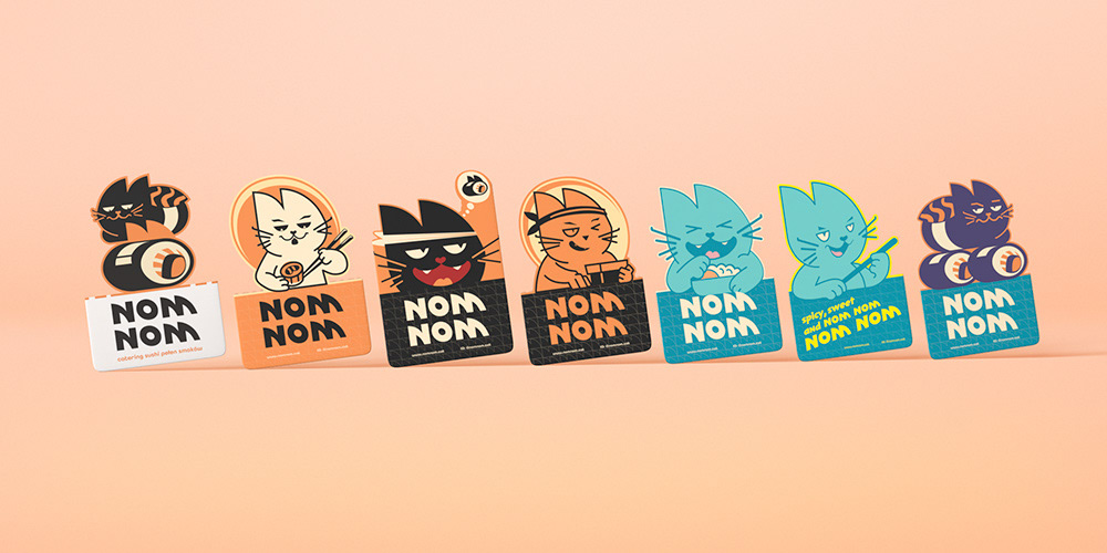
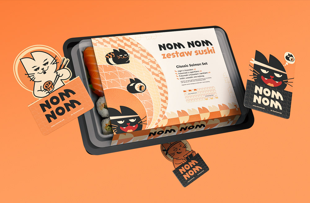
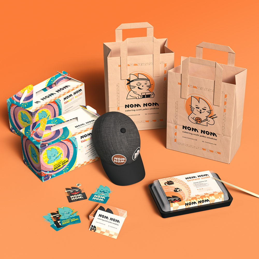
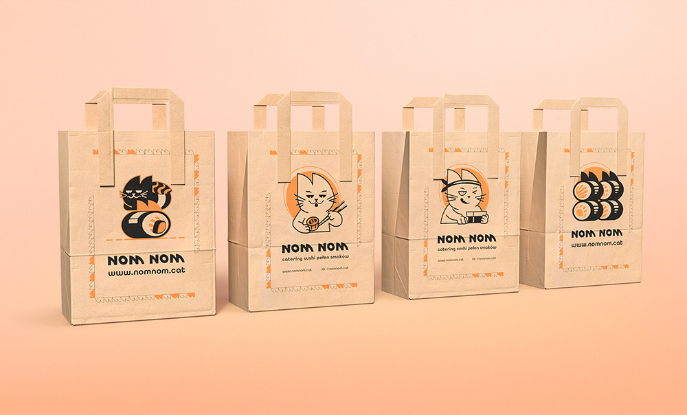
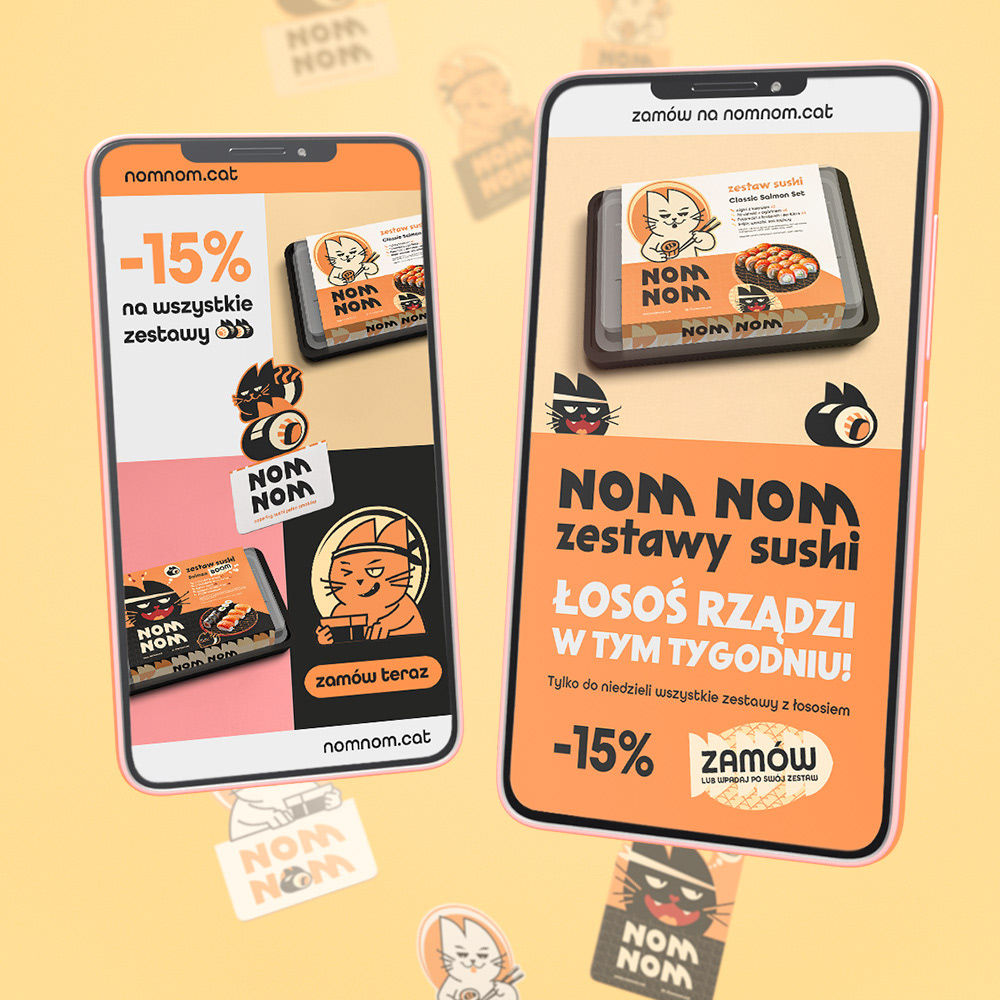
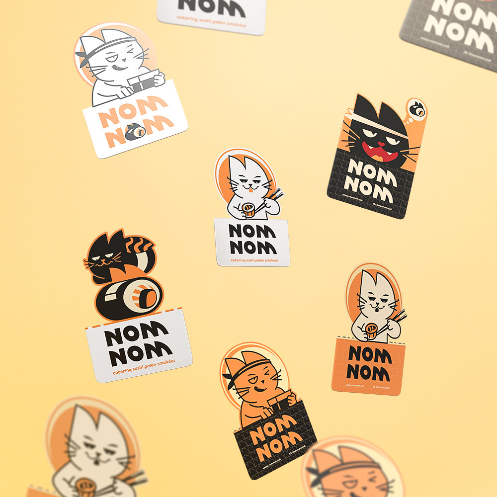
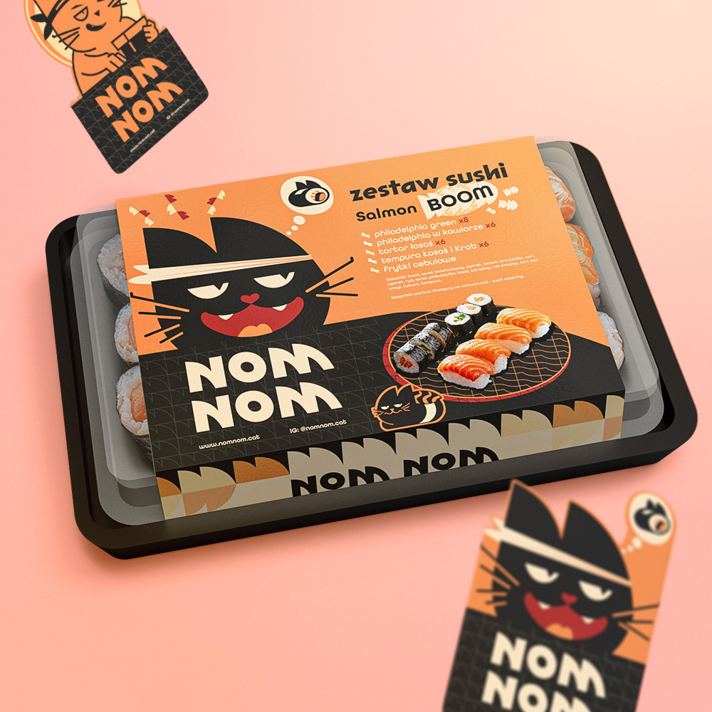
NOM NOM is a fictional sushi catering brand created for modern consumers – young, creative, and passionate about sushi. The brand is built on a strong visual identity, featuring a cat as its brand hero, which lends the project personality, playfulness, and memorability.
The brand name is an onomatopoeia expressing the sound of eating pleasure – “nom nom,” directly referring to the delightful experience of consuming exquisite sushi. The name is short, fun, and perfectly matches the presence of a cat as the brand’s mascot – an instinctive gourmet.
The graphic style is cartoonish and playful, with simplified forms and iconic shapes that make the visuals easy to recognize and adapt across applications.
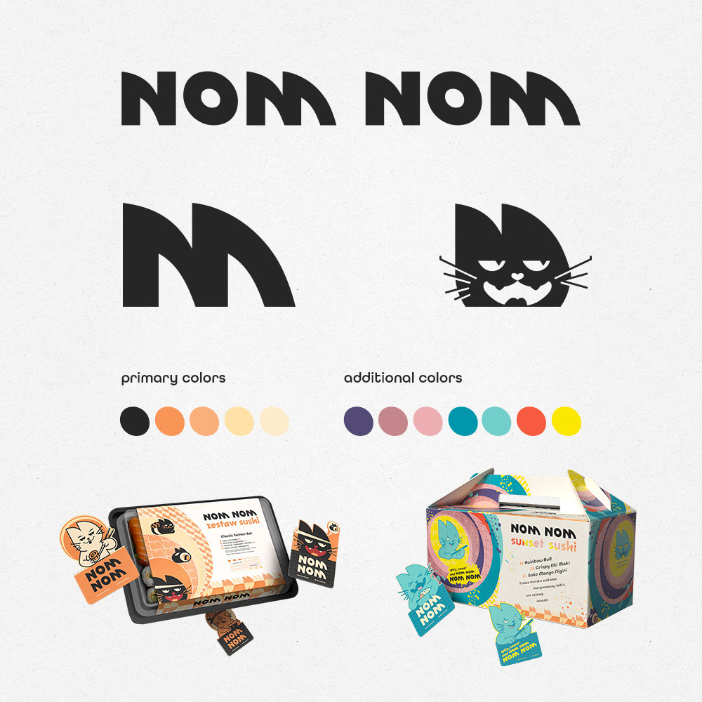
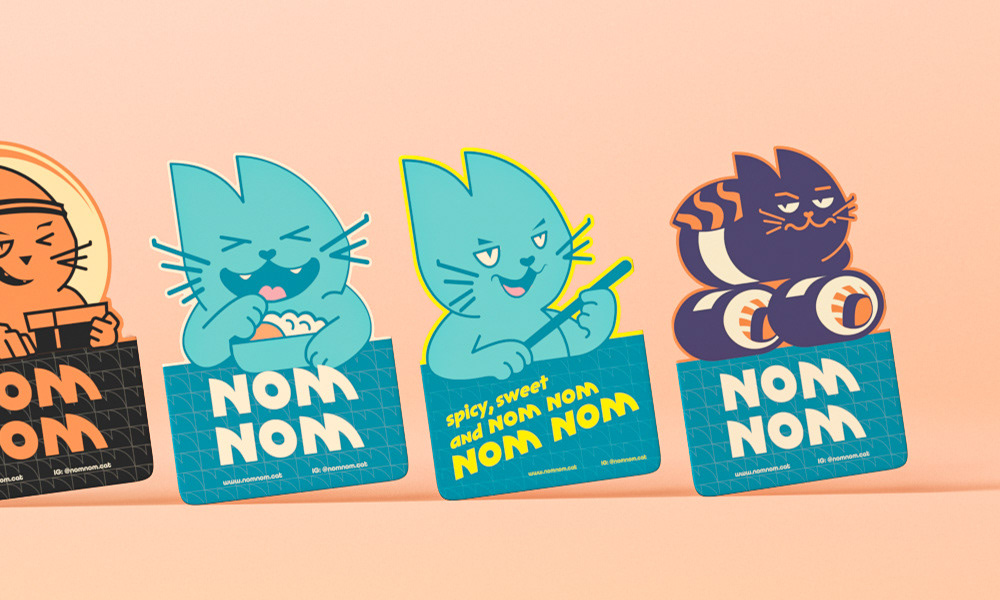
The color palette comes in two variants:
Natural and delicate (beige, salmon) – for classic sets that emphasize freshness and product quality,
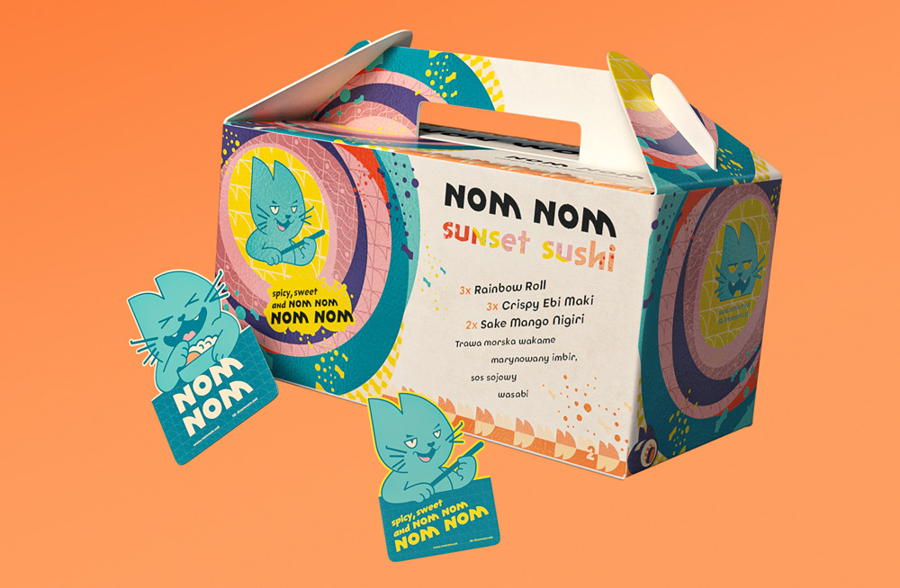
Energetic and vibrant (turquoise, purple, pink, mango, yellow) – for bold flavor combinations.
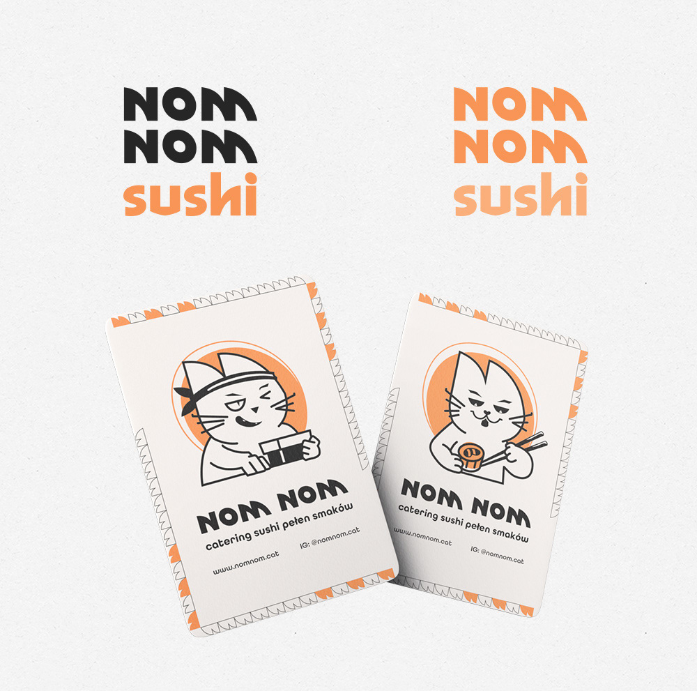
The brand's logotype is based on a geometric font with a strong, expressive rhythm that works well both in print and on packaging.
The brand's logotype is based on a geometric font with a strong, expressive rhythm that works well both in print and on packaging.